
Wishing all my readers a very happy New year 2026. This year I once again bring back the JOS tradition of posting about the colour of the year as the first post of the year. Pantone Colour of the Year 2026 is PANTONE 11-4201 – Cloud Dancer. However, unlike the COTY posts of the previous years, this year’s post is about the (non) colour and the significance of Pantone choosing it.

PANTONE 11-4201 Cloud Dancer
According to the Pantone website “Cloud dancer is an airy white hue that exemplifies our search for balance is between our digital future and our primal need for human connection—a liminal space that is a launchpad for creative expression—as individuals and communities are experimenting beyond traditional boundaries, opening the door to increased imagination and innovation.”
In less poetic terms it is a kind of white, the kind that you see on T-shirts, dhotis (and vesthis) after they have been washed a couple of times. It is the white of fabrics washed with “other detergents” in a detergent commercial. It is neither off-white, nor yellow, neither green nor blue but a light composite of them all.
Can white be the Colour of the Year?
People have been talking about how the Pantone Colour of the year 2026 is a transformative colour, providing that much needed calm in this world. It is spoken of as a colour that gives space for cultural growth and is a symbol of decolonisation. Technically, white is a combination of all colours but it is not a colour in particular. It is about softness yes, but it is also about standardisation and conformity, ideas that colonisation brought about. While I have been leaning towards whites in the last month – pearls, MoP, shell, white blog, white desert for vacation and so on, I am not convinced that it can be a colour of the year when it is not even a colour. Is this “Whiteness” signifying quiet luxury, Candida – transparency, the age of new beginnings, AI modelling or the need to step back and calm down. I an confused. Thankfully, it is not just me. Emma Joyce and Nick Miller feel that Pantone is trolling us all in this article.
(Could be) reasons for why Pantone chose it
In the last few years, Pantone COTY choices were rejected by a lot of people as it has limited application. Mocha Mousse did not suit most skintones – as it was the skintone of a good part of the population. Very Peri and Peach fuzz were disasters as well. In that regard, Cloud dancer is a safe bet. It works across industries – from tech to skincare, from fashion to automobiles. Just be changing the material and finish, the manufacturer could create a wide range of CMF directions. Plus, a softer white means no colour dyeing, less bleaching and more water consumption. Therefore, it poses as a sustainable colour at the very least. This is just my speculation and not the official word from Pantone.

Cloud dancer in Jewellery
Despite all my misgivings about the (non) colour, it is great for jewellery. Think satin finish glass beads or pearls and shell beads. Think matt rhinestones, moonstones, opals and cloudy white agates. Consider soft silk yarn, cocoons and even feathers. The options are aplenty if you want to make jewellery using cloud dancer.
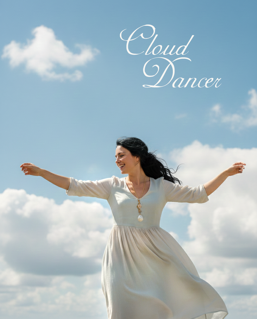
To illustrate my point, I have made a long twisted copper wire pendant with seed pearls, a large MoP teardrop, a lampwork bead gifted to me by Rozantia of Bairozan. I have soldered the pendant at a couple of places so that it will take the weight.

Here is an AI generated image of a model wearing that necklace and floating on clouds. She is indeed the Cloud dancer.
While the clouds look transcendental on a bluey sky, I would love myself some more colour.
What do you think?
I hope you find it interesting
Cheers

What do you think?