
While I have picked up the slack in my blogging these past few weeks, I must admit, rather shamefully that I haven’t participated in any blog or jewellery challenges for months. At first I did not find the inspirations “inspiring enough.” Then I got busy with my exhibition for NYCJW, then I hade college work, laziness to write blog posts, feeling let down by the abysmal sales with bouts of sickness thrown in between. Finally, I decided to put these thinly crafted excuses to rest and work/post for a challenge by making purple pink jewellery.
Honey Do List – January 2022
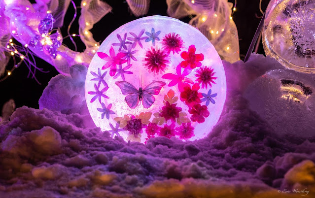
For the past several years, Sarajo and her husband, Eric, post a monthly photo inspiration on her blog and ask the readers to join her as she works on her “The Honey Do List”. After a gap of a few months, Sarajo has posted a purple-pink image for January. It is a photograph of an ice sculpture from the MN Landscape Arboretum’s Winter Lights display which has ice, led lights, butterflies and flowers in it. I have made so much of purple and pink jewellery before that I was wondering what I could do next. While the colours in the photograph are more towards the pink side, I spotted a wee bit of violet making me wonder if I could add Very Peri to the mix.

Pantone Colour of the year 2022 – Very Peri
When they announced Very Peri as the Pantone colour of the year 2022, like several others, I was also like, really another violet? Haven’t we had enough with Ultraviolet and radiant orchid not to mention the debacle that was serenity? However, I had seen this coming. WGSN through its colour forecasting agency Coloro had predicted the Colour of the year 2022 as Digital lavender. It was aa reflection of the time we spend online, the gaming influences, sets in the multiverse and the need to bond our souls to something.
Since the pandemic hit, I noticed that Pantone had slowly but surely moved from the colour space to position themselves as more of an overall forecasting agency. They started to host regular talks on seasonal forecasts, sharing insights for free. they went beyond colour, talking about zeitgeist, vision, materials, shapes and forms, in a way they had never done before. While many chalked this up to the digital revolution and the idea of free education that the pandemic had brought, I personally felt that they were openly challenging WGSN. Afterall, WGSN, had offered Coloro as a premium colour agency reducing the monopoly of Pantone in the colour space. Going forward, it will be interesting to watch how these two companies take on each other and what that would mean to the fields of fashion and design. You can read my previous Colour of the year posts here.

Very Peri and purple pink jewellery
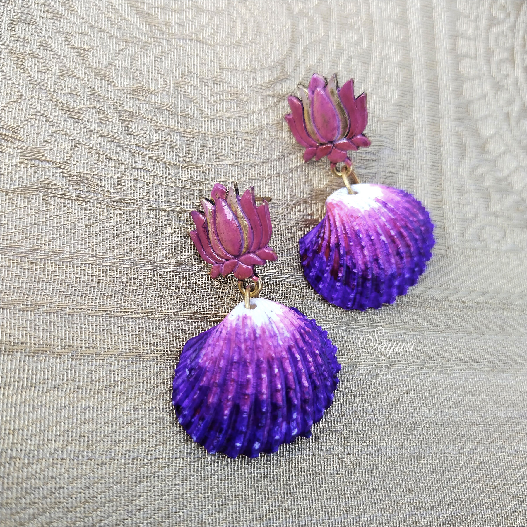
Instead of trying to jump start my languishing creativity to do something wondrous, I decided to re-invent whatever I had in hand. The first is pair of painted shell earrings. It was original a white shell on a gold colour stud. I used drawing inks to colour the shell and patina inks to colour the stud to get it to it’s present avatar.

The second is a butterfly pendant with agate and glass beads. I reused old bead swap earrings, and put back the components together in a different way. The third is a pair long of earrings agates in Very peri and pink and glass teardrops.

The past two weeks have been crazy with the second round of Covid at home with my mom and I testing positive. We decided to not give it a name, but we consulted our doctors, took our meds, rested when we could but did all our chores inside our house. I worked from home and taught all my classes to keep my mind busy. It was physically more draining than the first time as I could not fall asleep and both of us had come out of a viral fever only a month ago. However, I think it was emotionally a little better this time. I hope that it doesn’t mess with our bodies, minds and memory as before.
This post gave me the opportunity to play with beads and my tools for the first time in a month. I stepped out of my house after a 2 week quarantine today to take these pictures. It felt good to breathe in fresh air even if it was only for a few minutes on the terrace. Believe me when I say this, the irony of the situation (the inspiration and my state) is not lost on me. 😀

What do you think?