
While many of you will know that Pantone announces a colour of the year every year, many might not know that they also curate several colour palettes for specific purposes. One of the crucial services that they offer (for free) is the curation of colour palettes as seen in various fashion weeks. You can find such palettes on the Pantone website or subscribe to their newsletters and get them delivered to your inbox. Another great way to keep track of colour trends is to attend their seminars regularly for they are very informative. As a trend researcher and a designer, I understand the work that goes into making these reports, making me appreciate them even more.
When I saw the recent palette of Autumn-Winter 2022-2023 (AW 22-23) colours, I immediately knew that I had to show you the necklace that I made a few weeks back in this palette. Hence, this post on Jewellery in Pantone AW 22-23 colours.

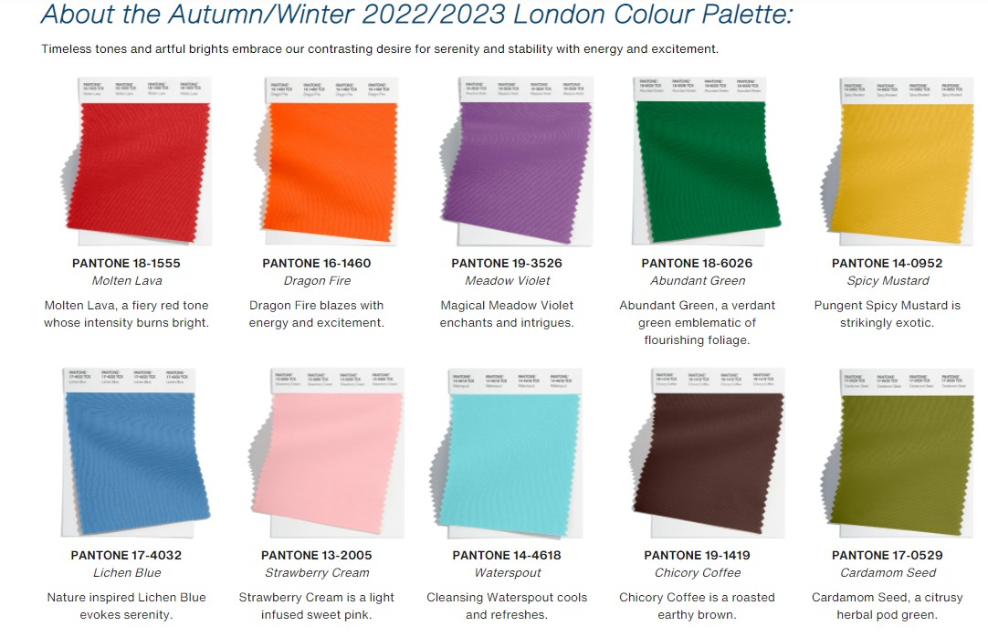
Pantone AW 22-23 colours
Trend analysts look at thousands of fashion show images from fashion weeks, sort and analyse them to find common colours, materials and trends. The repeating colours are extracted to create a useable palette. What really attracted me to the AW 2022-23 palettes is the inclusion of bright colours. Strangely the Pantone COTY 2022 – Very Peri, is not to be found here.
Typically western palettes and colour forecasts present the so called “earthy, autumnal hues” for autumn and deep colours and jewel tones for winter. While this may work USA and in Europe, it doesn’t work in India’s festive season which falls during the same period. We even refer to our fashion seasons as Spring-Summer and Festive-winter.
Therefore, I was happy to see a palette that will work in India. However, I wonder what this means. The obvious answer is that, the western world is moving towards an exhibitionism in dressing and home decorating after being stifled in the last two years. Pantone does agree with me, as mentioned in their recent seminar on AW 22-23 trends.

Jewellery in Pantone AW 22-23 colours
These two palettes are great for bead jewellery makers. Not only can use a combination of colours from the above palettes, you can also you them for single colour pieces. Colours such as Molten lava, orange tiger, samoan fire or chicory coffee, cardamom seed and spicy mustard work fantastically well together. In the necklace with the yellow kolam pendant below, you can see how the reds, yellows, pinks work together.

Monochromatic jewellery in Pantone AW 22-23 colours
When I first saw these palettes (3 weeks ago) I had just received a couple of orders. One was to make a kolam necklace and the other was to make three pieces in single colours with temple gopuram pendants. Inspired by this bold palette, I decided to make the pieces in these colours. The Kolam piece is in magical Meadow violet with a sprinkling of teal, sea green and magenta.

The next one has cool teal blue – water sprout beads with a cord closure in a more mid tone blue. I added accents of strawberry cream beads to give the piece a little contrast.

The third piece is in spicy mustard. I have never really found this colour interesting before, but now I think that it works great with gold. I did make one more piece in red – lava falls but I am yet to photograph it. Hopefully, I will add it to the post aster photographing it.

Well, those were the Jewellery in Pantone AW 22-23 colours that I made recently. The first one is available for sale and the rest are sold.
Many of you might wonder why I would need a colour palette when working with single colour beads/necklaces. In my opinion, having a palette of colours is helpful when you work with colours you do not typically work with. It allows you to see the colours in visual content and hopefully in a new light. It is a bonus when it is trend based palette as the jewellery that you make based on it, will be more aligned with the trend and have more marketability and acceptance.
Please do share your thoughts on what you make of the palettes and the jewellery based on them.
I hope you find it interesting
Cheers

What do you think?