
Pantone just announced its COTY, Colour of the year 2024 and it is Peach Fuzz! My first impression was yikes! This is the name for unwanted facial/body hair. It is the colour of puke. If you look carefully, the colour of vomit is not the bright green that you see in emojis. It is peach fuzz. Therefore, I do not understand why Pantone, in all their wisdom thought this was the best colour of the year. This is the third orange-like colour that Pantone has picked after Tangerine Tango and Living Coral which were brighter, happier colours.

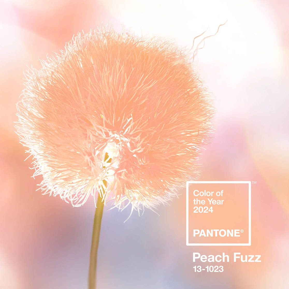
Pantone Colour of the year 2024 – Peach Fuzz
Before dissing the colour any further, lets first make a note of what the experts at Pantone are saying. In their COTY launch webinar, they described Peach fuzz -PANTONE 13-1023 as a tranquil colour of community and that it represents those whom we love. The colour reflects the past and yet brings about a contemporary ambience of lightness. It indicates the need to recalibrate our priorities to focus on health, family and for self-care. It is supposed to be soft, nurturing, warming, and reassuring. The colour signifies moments of human creativity and indicates that design is moving towards soft-futurism. It makes human skin tone look lighter and brighter. The expert speaker said that she “just wants to touch it and to wrap herself in it.” Me, not so much.
Is the colour of the year a scam?
In the last couple of years we see the lessening influence of the colour of the year in both fashion and non fashion industries. Viva magenta, despite being a vibrant hue was unpopular. Several experts are saying that the concept of colour of a year is a scam it is solely done to consolidate marketing efforts. I for one partially agree. There is also this growing competition between Pantone and WGSN, with Pantone trying to get back at WGSN’s Coloro for beating them at their colour forecasting game. Its another (sad) story that Pantone tried their hand as forecasting vision and not just colours and could not sustain themselves after the pandemic.


Apricot Crush (Coloro 024-65-27) is WGSN’s colour of the year 2024
In 2021, WGSN’s Coloro proposed digital lavender as the colour of the year 2023 as a long term forecast. Pantone jumped in with a similar looking hue – Very Peri and announced that it was the colour of the year 2022 to get a lead in the market. It looks like their cycles have finally synced. WGSN is proclaiming Apricot crush (another peachy-orangey colour) as the colour of the year 2024 and Pantone is hailing Peach Fuzz. While I hate both (and all forms of orange), I will take Apricot crush over Peach fuzz for it’s got some warmth and saturation in it. I find it impossible to accept peach fuzz.
But for now, I will put my personal distaste aside and tell you how colour can be used.
Peach fuzz in fashion and interiors
Pantone in the coty launch presentation showed how the colour was ideal for the apparel and the home furnishing industry. The references that they showed included thick knits, braided blankets, puffer jackets, terry towels, athleisure, nightwear and other casual garments. If you were to visualise the words soft, fluffy, and cozy it would be in the form of the items in those visuals. Think fleece, cashmere, felted wool, washed cotton and silk satins. I am unable to see it as a party wear or High Fashion colour. However, it could probably work as a cotton kurta, a men’s casual wear shirt or as a chiffon saree in India. In silk sarees and dhotis, sandal is a popular colour and peach fuzz could be promoted as an extension of sandal. The use of peach makeup – blush, lipstick and nail paint may increase.

While Pantone showed peach carpets and area rugs, I do not think that they are practical. Peach shows dirt and grime quickly and such carpets would need constant maintenance. It may work better as a wall colour, an appliance, cushion cover or as wall art.

Peach fuzz in jewellery
There are several gemstones in peach. The most common are peach sapphire, including the most valuable padparadscha sapphire. Morganite is typically pink but you can find peaches too. Peach quartz, pearls, peach garnets (Mahenge garnet), peach moonstone, and light carnelian are other gemstones that you can consider. You can always go for dyed agate, onyx, and jade for a dull peach colour. Take a look at my gemstones in orange for a list of more orange coloured gemstones. Glass beads, crystals, fibres and fabric in peach fuzz will work for those who want to follow this trend.
Parting thoughts
I understand that many people like this colour and will use it extensively. But, if you like me dislike the colour but want to incorporate the trend in your work, then this is for your. Use peach fuzz as an accent colour – a tipping on your shirt, or a scarf on a dark solid outfit, a focal bead or a clasp connector on a necklace of beads of other colours. You can use it in small quantities by reducing the size and proportion. Alternatively, you can add a peach patina wash over a metal component. It will add a tinge of colour while retaining the texture and shimmer of the metal component.
Please share with me your thoughts on Peach fuzz and Apricot Crush. Do you like them? Will you use them in your work? If so, how?
I hope you find it interesting
Cheers

What do you think?