
By now you must all know that that Classic Blue is Pantone colour of the year 2020. Though touted as a boring and uninspired choice, classic blue is a crowd pleaser. Blue is considered to be the colour of calmness, stability and dependence. It is also a colour that suits all skin tones. Blue jeans (denim) are one of the most bought and worn items of clothing in the world. According to Colour psychology, every colour has positive, neutral and negative connotations. Here is a list of connotations of classic blue.

Positive connotations of classic blue
- Vastness and openness ( the evening sky)
- Stability and security
- Dependable
- Calmness and tranquility
- Advancement
Neutral connotations
- Formal
- Uniform
- Scientific
- Ordinary or usual – common
Negative connotations
- Melancholy
- Despair
- Moodiness
- Loneliness

Classic Blue Pantone colour of the year 2020
Laurie Pressman, Vice President of the Pantone Color Institute, has said that the 2020 palette is sea and coastal area inspired. As part of its promotional campaign, Pantone collaborated with several companies. They developed a hamper potraying the sound, taste, smell, and texture of Classic Blue. It includes a a musk-and-sea-salt-scented candle, suede-like fabric, a blue, berry-flavored jelly, and an audio track titled Vivid Nostalgia by Audio UX.

COTY – colour of the year and its influence
Whenever I teach Trend forecasting, my students always wonder if the publicity of the trends artificially make the trend work. Or do they predict what the future holds? This is an interesting question for trend forecasts work in both ways. It is almost like a business idea for a new product or service. You forecast (never predict!) what you think will work in the market (never society!) in a year or two from now. This is done after extensive research and study of the socio-cultural, political and economic climate of the times. Lifestyle shifts and patterns are noted as well.

But once the forecast is out, it is also heavily promoted – collectively by big and small players. This ensures the market feasibility of the products made based on the forecast. A colour forecast and particularly a COTY is no different.

Market viability is one of the biggest reasons why Pantone comes up with several palettes that show the use of COTY. While all of us might wear blue jeans, some of us may pair them with bright colour tees or shirts. Others, may stick to black or white tops and tees to keep it classic. A few would dress it up with a metallic sequinned top for a party or pair it with a patterned kurti for an indo-western look. Denim-on-denim and wearing dark jewel tones with denim also work. Blue being a staid staple lends itself well to be used with a plethora of colours. All palette images are from the Pantone website here Pantone colour Palettes for 2020

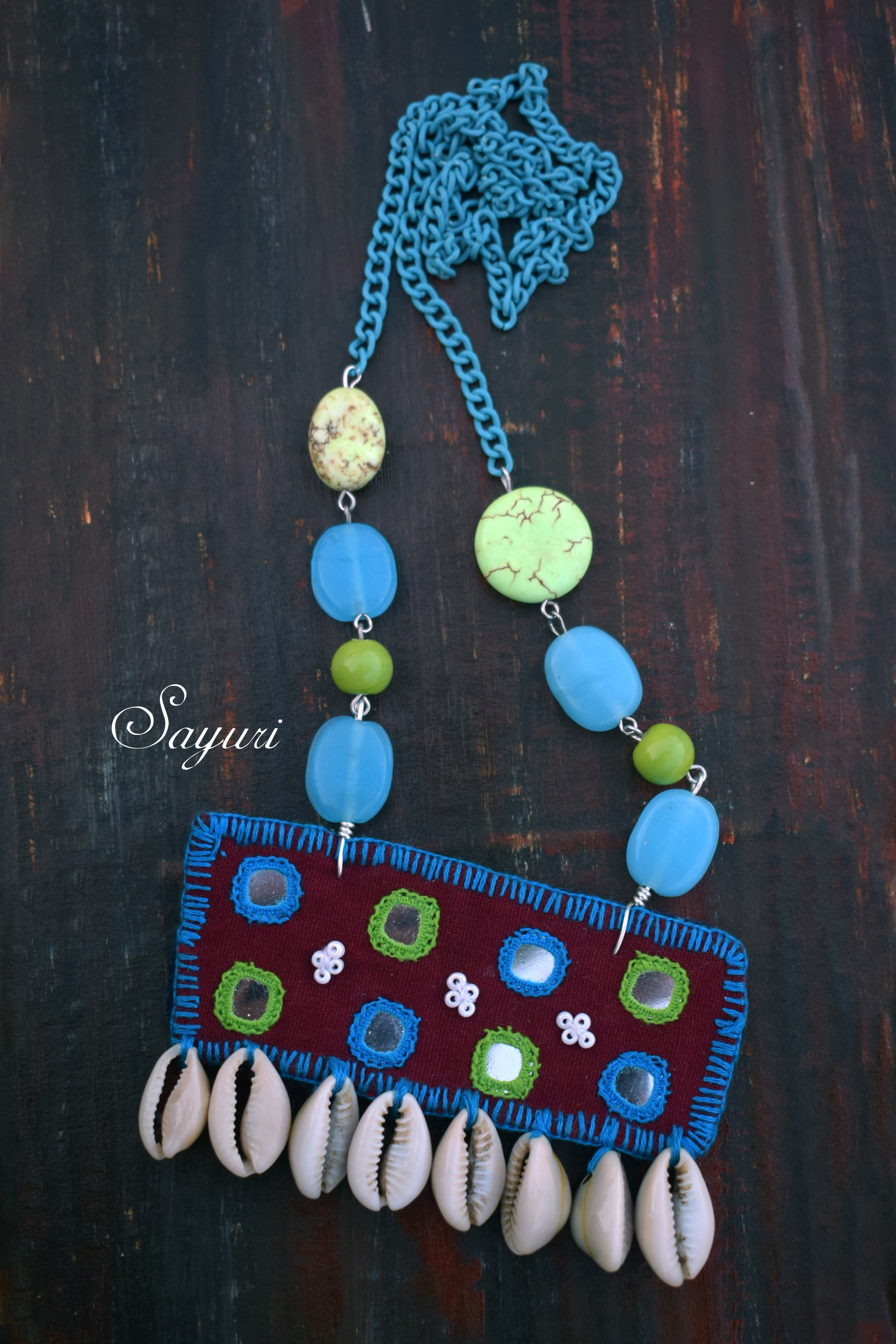
Blue in Jewellery
Classic blue is a great colour in the textile, tech and apparel industry. However, it is limiting when it comes to jewellery. This blue works well with other blues, greens, reds and oranges.”Untraditional” palette (above) is great for costume jewellery. Furthermore, “exotic tastes” and even “desert twilight” can be manipulated to suit your audience. But, I would personally use the colours in the different proportion to those suggested by Pantone. If you work with gemstones, please check out my article on Gemstones in blue to understand the various blue stones available for use. Check out the gallery below to see examples of beaded necklaces in blue.


Forecasting the occurrence of blue with metallics like copper and gold, I created two earrings tutorials. One is the published Lapis lazuli and copper earrings that uses tongue cleaners. The other is the Wired copper earrings that will be published next week.
That was all about the Classic Blue Pantone colour of the year 2020. Groups that I am a part of like the Bead peeps and Earrings everyday are using the colour as a challenge point for jewellery. It would be interesting to see how makers interpret COTY 2020. As always do send in your thoughts, ideas and inspiration points for blue in the comments.

2 responses to “Classic Blue Pantone colour of the year 2020”
Thank for this summary, Divya! The Pantone suggested palettes are weird at first sight but they bring some playfulness to the classic blue. Even though they look unusual, it will be a good idea to explore them. As for trend forecasting and promotion, it looks like people like to have trends and be trendy and businesses make the best out of it. Is it inherent or acquired behavior / psychology? Mother Nature has many examples in favor of “inherent”, I think 🙂 Hence, of course the desire to be totally different and the discussion can become endless 🙂
It is a valid point. At times human beings (sometimes even animals) want to be unique and assert their individuality. At other times they want to be accepted by their pack or clan. Both these qualities, in my opinion make people explore and follow trends.